NOVEMBER 18
PRINCIPLES OF DESIGN
unity - balance - hierarchy - contrast - rhythm
unity - balance - hierarchy - contrast - rhythm
WEB DESIGN: THE GOOD AND THE BAD
GOOD
Background color does not interfere with legibility of the text.
Text is not too big and not too small.
Navigation is consistent and easy to understand.
Graphics are used to break up large areas of text.
Hierarchy of information is clear.
BAD
Color combinations and distracting backgrounds make text illegible.
Text is too big or too small.
Text stretches across the entire screen, decreasing legibility.
Paragraphs of text are bold, italicized, in caps, or all three.
Use of meaningless or useless graphics.
Navigation is inconsistent and difficult to understand.
Lack of hierarchy and unity.
HERE ARE A FEW EXAMPLES OF GOOD & BAD DESIGN...
TASK 1: SELECT A POORLY DESIGNED WEBSITE
|
1. Choose a LOCAL BUSINESS you're interested in with a POORLY DESIGNED website. (Keep in mind the features of good and bad web design we've discussed in class.)
2. In addition to your initial website selection, research 5 OTHER WEBSITES for businesses within the SAME INDUSTRY as your selection. For example, if your local business is Brookline Booksmith, compile a list with 5 other bookstores. Your list does NOT have to be comprised of all local businesses, but it must include 3 WELL-DESIGNED websites and 3 POORLY-DESIGNED websites. Provide at least 3 REASONS why EACH website is well-designed or poorly-designed. Make your list as in the example on the right, label it (TASK 1_LAST NAME, CLASS PERIOD), upload it to Google Drive, and share it with me at [email protected]. |
EXAMPLE
TASK 1_SNELL, 4.doc 1. Brookline Booksmith (http://www.brooklinebooksmith.com/) - confusing layout and lack of hierarchy - no consistency on secondary pages of website, both in navigation and in text treatments - unappealing, boring color scheme throughout website 2. Commonwealth Books (http://www.commonwealthbooks.com/) (list 3 reasons) 3. Newtonville Books (http://www.newtonvillebooks.com/) (list 3 reasons) 4. Brattle Book Shop (http://www.brattlebookshop.com/) (list 3 reasons) 5. Trident Booksellers (http://tridentbookscafe.com/) (list 3 reasons) 6. Barnes & Noble @ Boston University (http://bu.bncollege.com/) (list 3 reasons) |
NOVEMBER 19-21
|
VISUAL COMPETITIVE ANALYSIS
PURPOSE To present data in a way that makes it easy to compare website designs within the same industry. These analyses help to identify the strengths and weaknesses of top competing company websites. 3 PARTS 1. Title 2. Images of competing website designs (generally the homepage and one secondary page for each) 3. 3 characteristics (may be good or bad) of each website design |
TASK 2: VISUAL COMPETITIVE ANALYSIS
|
Use InDesign to create a visual competitive analysis following the steps listed below:
1. Take screenshots of the homepage design as well as one secondary page for EACH of the 6 websites you selected. (To take a screenshot, hold down command + shift + 3). You should end up with 12 images in total. These images will be on your desktop. Put them all into one folder titled "Website Screenshots". 2. Create a new document in InDesign: File > New > Document Document size: width 11 in, height 8.5 in Margins: top 0p0, bottom 0p0, inside 0p0, outside 0p0 3. Place your desktop screenshots into InDesign: File > Place > Select all images from desktop by holding down Shift. * NOTE: Do not drag images into file straight from desktop. 4. Your images will likely appear very large in your document. To make them smaller, select ALL your images by highlighting and resizing by holding down command + shift. 5. Start to organize your layout. Layout > create guides > rows: 2, gutter: 5p0. 6. Pair the homepages with their secondary pages as seen in the image to the right. Make sure that the homepage is in front of the secondary page. To do this, click each homepage screenshot, and go to object > arrange > bring to front. 7. You should have 2 rows of 3 websites in your layout. Use the blue guides you created to align the bottoms of the top row of websites and the top of the bottom row of websites. 8. Add text. Click the T tool from your toolkit. Start by numbering each of your sets of screenshots in a font of your choice. You may place each number in a separate box and use the automatic guides InDesign provides to help with alignment. Then, write the numbers and the corresponding website name in a column on the righthand side of your document. List the 3 characteristics of each website under each title, as you have already brainstormed and recorded in yesterday's GoogleDrive document. * ALIGNMENT IS KEY. Make sure every element of your layout is aligned to something else. Note the flow/rhythm of the good layout versus the bad layout. 9. Add a title to your document, "Company Name" Visual Competitive Analysis Your Name 10. Save, export, and e-mail your .pdf file to me at [email protected]. File > Save As > Task 2_Last Name, Period.indd File > Export (as .pdf) > Task 2_Last Name, Period.pdf |
GOOD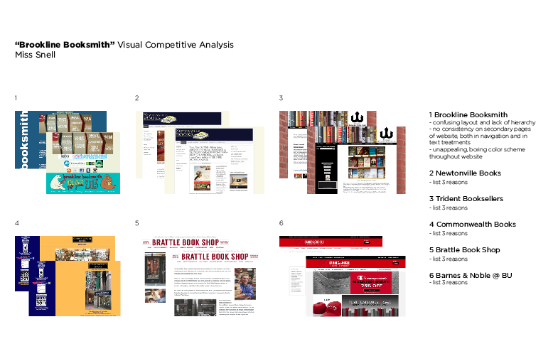
|
NOVEMBER 22
TO DO LIST
1. Do one blog post.
* THIS IS HOMEWORK IF YOU DID NOT FINISH IT IN CLASS
2. Make sure you have completed Task 1.
- Select a poorly designed website for a local business.
- Determine the industry for your business selection.
- Choose 5 other businesses within the same industry.
Research their websites.
- Make a list of all 6 businesses, and write three characteristics
(good and bad) about each one.
* I WILL BE GRADING THIS ASSIGNMENT; PLEASE BE SURE TO
UPLOAD YOUR FILE TO GOOGLE DRIVE AND SHARE
IT WITH ME AT [email protected]
3. Continue working on Task 2. Export your document as a .pdf and
e-mail it to me after you have double-checked that your document includes the following:
- 6 websites
- 12 (not pixelated) images (homepage & secondary page for each website)
- Numbers for each image
- Title (must include "Company Name" Visual Competitive Analysis, Your Name)
- 3 characteristics (bad and good) for each website
- Alignment of all elements
- Correct spelling and grammar -- d0 kNot typ lik thiss plz!!!!!!!!!!
NOVEMBER 25
|
TO DO LIST
1. Complete Task 2. Export it as a .pdf and e-mail it to me today at [email protected]. 2. Mini in-class critique: - Once you have completed Task 2, find a partner. - E-mail your Visual Competitive Analysis.pdf to your partner. - Review your partner's Visual Competitive Analysis, making sure that he/she has included all of the requirements for the document (see #3 on the November 22 post). Jot down any suggestions for improvement you have for your classmate. - Share your feedback with your partner. - If you would like, you may make changes to your document after hearing your partner's critique and resubmit your .pdf of Task 2. I will grade your most recent submission instead of the original! |
NOVEMBER 26
|
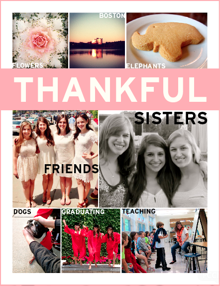
I AM THANKFUL FOR... INDESIGN
Using InDesign, compose an 8.5x11 in or 11x8.5in document using words and images to express everything you're thankful for this Thanksgiving. Focus on the principles of design as well as the InDesign skills we've learned and discussed in class over the past week. Be sure to create guides, use the type tool, overlap images, place photos in your document instead of dragging them, and save and export your file as a .pdf and e-mail it to me with your name. When you're designing, answer the following questions for yourself to help guide your process: Does my document show clear hierarchy? How does the scale of my text and images help to determine this hierarchy? Does my document have a rhythm and comfortable flow throughout? Are the elements in my document organized and aligned? If the images I selected were on a website I visited, would I be interested or bored? Have fun with this. Try clicking on InDesign icons we haven't learned and find out what they do, too! |
|
DECEMBER 2-3
|
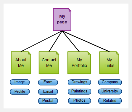
SITE MAP
A site map is a structural representation of a website’s architecture. PURPOSE To provide an organized overview of all the content on a given website at a single glance. Site maps show the flow of a website and help to identify usability issues -- ensuring that all information is easily accessible to users. Site maps may be bulleted, text versions of the site navigation, or in a format similar to a flowchart, as shown to the right. * The example provided is a very basic site map containing only a few links to additional pages. Websites generally have a greater number of secondary pages and links than in this example, and site maps for these websites appear far more complex. |
BASIC SITE MAP EXAMPLE
|
TASK 3: SITE MAP FOR BURLINGTON.ORG
|
1. Divide into 4 groups. All work for Task 3 will be done in these groups.
2. Visit the website http://www.burlington.org/. Click on each link to get a sense for the website's flow. Discuss the pros and cons of its navigation. 3. Develop a site map (in chart form, not list form) for a new and improved website for http://www.burlington.org/. * Focus on: - User-friendly, clear & consistent navigation - Redundancy in navigation (to ensure that your users can always find the page they are looking for) - Having a reasonable number of links to additional pages - Ordering your secondary pages in the most efficient way - Design that is sImple but informative - Relabeling titles if they are unclear - Grouping content from multiple pages if this will make information more accessible and understandable - Main navigation should be short & to the point (ex. "Contact Me" rather than "Get in Touch with Me Right Now") |
DECEMBER 4
|
TO DO LIST
1. Check your grades on Aspen. 2. Complete 2 blog posts for this week. You should have completed a total of 15 blog posts by this Friday. 3. Complete Task 3 with your group. Make sure everyone in your group is clear as to the changes you made to the current website navigation, and how your changes would be beneficial to its users. We will discuss this as a class when all groups have completed the task. 4. Hand in Task 3, whether as a paper copy or as a .pdf e-mail attachment. TASK 4: SITE MAP FOR POORLY DESIGNED WEBSITE 1. Develop a site map for the current, poorly designed website you chose for Task 1. Please be sure to include ALL of the current links for your website on your site map. These site maps are to be done on graph paper, which I will supply. This is due at the beginning of class on Friday, December 6. You will be graded on neatness and completeness. DECEMBER 6DUE TODAY
1. A total of 15 blog posts
2. Task 4: Site Map for Poorly Designed Website DO TODAY
As a class, we will review the site maps for the poorly designed websites, focusing on the importance of usability & clear navigation. Keep the following questions in mind when evaluating the site maps.
- Based on the site map, is the website clear and simple? - Based on the site map, what is confusing, overwhelming, or distracting about the website? - What changes could I make as a web designer to improve the usability of this website? TASK 5: SITE MAP FOR NEW & IMPROVED SITEPart 1: Site Map on Graph Paper
1. Develop a new & improved site map for the website you chose for Task 1. These site maps are to be done on graph paper, which I will supply. This is due at the beginning of class on Monday, December 9. You will be graded on neatness, clarity and innovation -- showing that you made effective changes to Task 4's site map. DECEMBER 9TASK 5: SITE MAP FOR NEW & IMPROVED SITEPart 2: Site Map in Gliffy
1. Transfer all the information from your paper site map onto the computer, using Gliffy.com. You may choose to have each level of hierarchy represented by a different color to enhance the clarity of your site map. 4. When your site map is complete, save it. Then, export it as a .pdf by selecting File > Export > .pdf. DECEMBER 10-11MOOD BOARD
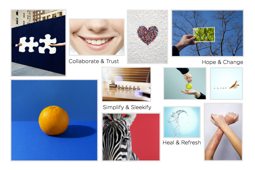
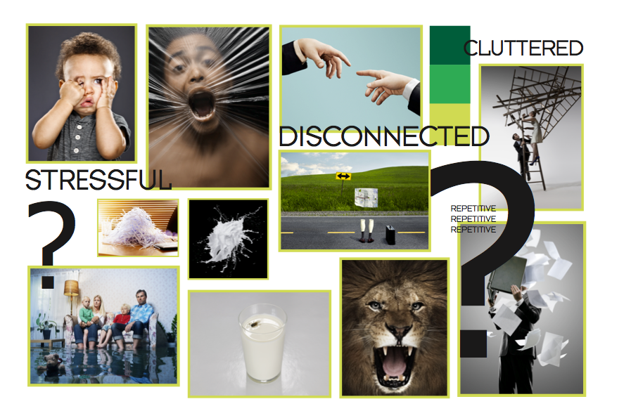
A mood board is a document containing a collection of images, colors and text that reflect the overall feeling, or mood, of a website. PURPOSE To quickly inform clients of the projected feel of a website. * What mood do you sense when observing the 2 mood boards to the right? TASK 6: MOOD BOARDS1. Use InDesign to create 2 mood boards: 1 for the current look and feel of your website, and 1 for your new & improved website. Include images, colors, and text. Your mood boards should each have at least 8-10 images.
2. Your document size will be 11 in x 8.5 in. Please gather all photographs from sxc.hu -- not from google.com. DECEMBER 12WIREFRAME
DECEMBER 13-20You will be redesigning your poorly designed website. Think back to our very first lesson -- what are the elements of good and bad website designs? How can you make your website stand out?
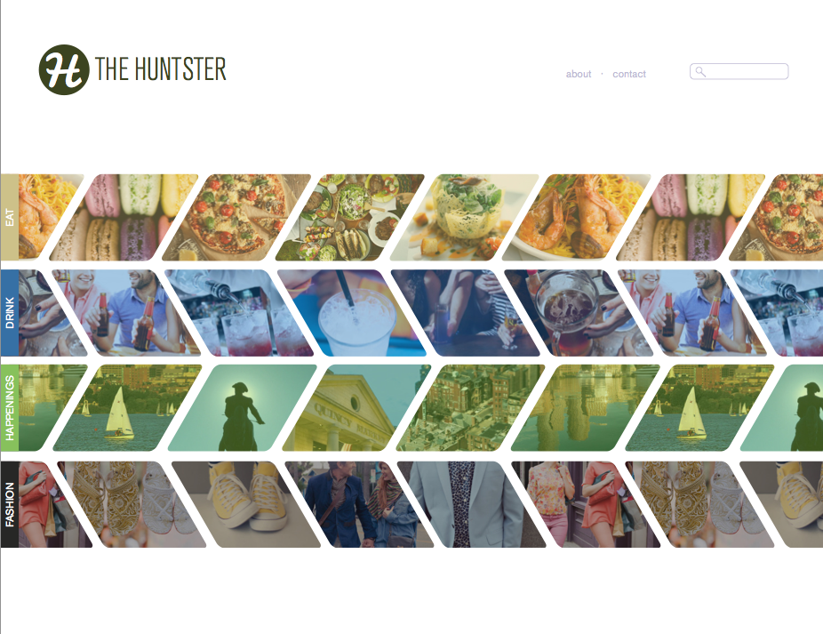
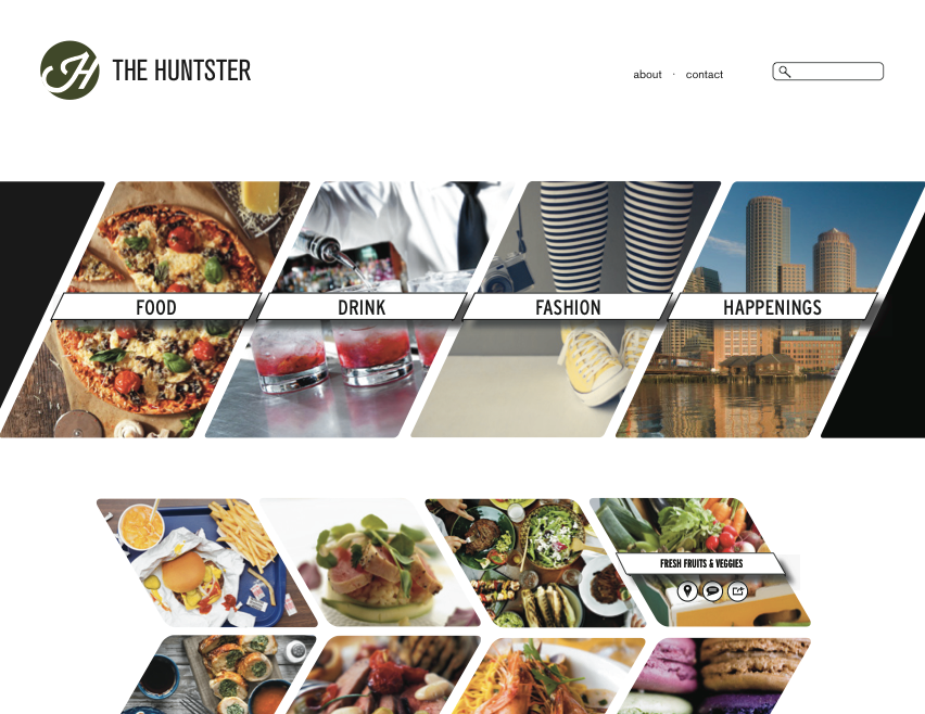
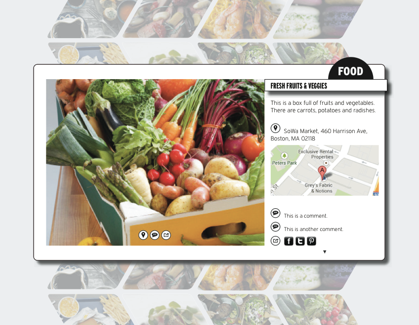
The website pages to the right are 2 different concepts I developed for a client recently. TASK 8: WEBSITE REDESIGN
1. You will build your website in Photoshop. Open a Photoshop document. Be sure your document has the following settings: 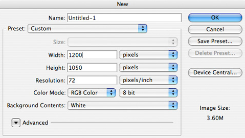
2. Use your wireframe from Task 7 as a layout guide. Your redesigned website does not have to be identical to your wireframe, but it will be helpful as you begin redesigning your site. Where will you place photos, the company logo, and text? Search for striking images that will make your website stick out. Look back to your Visual Competitive Analysis from Task 2 to remember what other businesses in the same industry are doing on their websites. Which elements were working well, and which ones were not?
3. On your website, you want to showcase your company's best attributes. How will you translate the feelings you expressed in your mood boards from Task 6 into a real design? What color scheme makes most sense for your company? Choose colors that reflect the personality of your company. 4. You may notice that most websites have some degree of 3-dimensionality -- on photos, text, buttons, etc. Experiment with these techniques as you design your own website. You may use the tools below to get started. Layer > Layer Style > Drop Shadow, Inner Glow, etc. Layer > New Fill Layer > Gradient You may also visit the following website for additional, easy ways to add 3-dimensionality to your sites: http://sixrevisions.com/tutorials/photoshop-tutorials/how-to-create-a-clean-web-20-style-web-design-in-photoshop/ SELF-CRITIQUE 1. Is my newly designed website unique and different? More specifically, which parts of my website are unique and different? 2. Does my website show clear hierarchy? Which element is my eye drawn to first when I look at my design? What makes this element stand out? 3. Does my website contain elements with 3-dimensionality? 4. What changes did I make from the old to new website in order to make it more visually appealing and/or easier to navigate? JANUARY 6-10HAPPY NEW YEAR!1. Continue working on your website redesign.
JANUARY 13-14CRITIQUE OF REDESIGNED WEBSITES
JANUARY 15EVALUATION
Please fill out the evaluation provided in the link below so I can learn ways I can improve as a teacher! https://docs.google.com/a/bpsk12.org/forms/d/15qx59BXueP8bzmKsixNfxnKbMEvnrbU9kyEc7EmRQN0/viewform |
BASIC WIREFRAME EXAMPLE 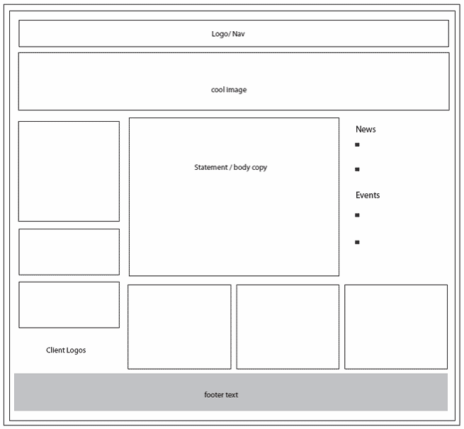
|
